Table of Contents
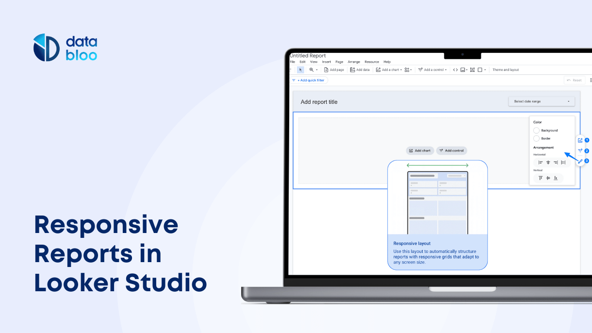
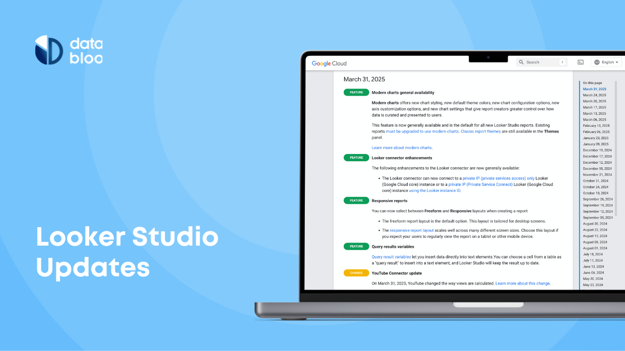
In April 2025, Google introduced Responsive Reports in Looker Studio—a major step forward in how we build and view dashboards across devices. Unlike the traditional freeform layout, responsive reports automatically adjust the layout of your charts and components to look good on different screen sizes, including tablets and smartphones.
Whether you’re building internal dashboards for your team or client-facing reports, the responsive layout allows for a cleaner, more consistent mobile viewing experience. In this guide, we’ll explain how responsive reports work, how to create one, layout recommendations, and what limitations to keep in mind.
What Are Responsive Reports in Looker Studio?
Responsive reports are a new layout option that makes your dashboards scale and rearrange automatically based on the screen size. This is especially useful if your audience often views reports on mobile devices or tablets.
You now have two layout types when creating a new Looker Studio report:
- Freeform: The classic layout where you manually place and size each chart.
- Responsive: A new layout that uses a 12-column grid system and flexible vertical sections to make reports mobile-friendly.
This new feature introduces sections, which group components together and control layout behavior. These sections stack vertically and auto-adjust their height based on the tallest chart inside them.
How to Create a Responsive Report
Creating a responsive layout is simple, but you’ll need to start from scratch—existing reports can’t be converted to the new format (unless they have only one chart).
Here’s how to get started:

- Go to Looker Studio and click on Create > Report.
- Add a data source to your report.
- When prompted to choose a layout, select Responsive instead of Freeform. When you create a responsive layout, Modern Charts are enabled by default. This means your charts will automatically use the updated visual style, including rounded corners, new color themes, and improved layout options.
- Use sections to group charts and controls logically.
- Customize each section and apply section-specific filters if needed.

Each section spans the full width of the screen. The charts inside follow a responsive grid and adjust their size automatically.
Sections and Blocks in Responsive Reports
Sections are the core building blocks of a responsive report. Each section can include one or more components, such as charts, filters, or data controls. Unlike the freeform layout, where each element can be freely positioned anywhere on the canvas, the sections organize components in a clear vertical flow. This makes it easier to keep your report clean, easy to scan, and consistent across different screen sizes.
By default, Looker Studio places the page name at the very top of the report. This acts as your report header. Directly beneath that, you can add useful controls—like a date picker or filter for specific dimensions such as Country or Device Category. If you are working with multiple data properties, such as different GA4 or GSC accounts, this is also where you can insert a data control that allows you to switch between them (this feature is only available for Google sources).

Once the header area is set, you can begin adding your first section or block. Each section follows a 12-column grid, and you can adjust the width of each chart by dragging the placeholder to span the right number of columns.
For example, a KPI card may span 3 columns, while a wider bar chart might use 6 or even all 12. This grid system helps you create a balanced layout and ensures that everything scales neatly on mobile or tablet views.

There are several useful things you can do with sections. You can add filters that affect only that section, allowing for isolated analysis within specific parts of your report.
You can drag and drop components from one section to another or reorder the entire section by grabbing the handle on the left.
Styling options are also available—so you can customize the background, padding, and alignment of all charts within a section at once.
And if you ever need to change the data source across a group of charts, you can apply the new data source to the entire section without updating each chart individually.
Tip: You can copy and paste an entire component (i.e. scorecard) and easily replicate it within your blocks.
Page Layout Structure
To help you build a clean and effective layout, here’s a suggested structure that works well across devices:

- Top Section: Scorecards Start with 4–6 most important metrics for your analysis (e.g., sessions, clicks, revenue) in a horizontal line. These KPIs give users a quick snapshot of performance.
- Middle Section: Time Series Use a time series chart to show trends for your key metrics. This visual context helps users interpret the scorecard numbers.
- Bottom Section: Analysis Modules Add 2–3 blocks with deeper breakdowns—such as channel performance, top pages, campaign breakdown or product analysis. These sections can include tables, bar charts, pie charts or maps.
You can repeat this pattern to build multiple blocks within your report, keeping things structured.
This approach not only helps you keep the report structure consistent, but also improves user experience by guiding them through a natural top-to-bottom narrative of your data.
How to View Responsive Reports on Mobile
One of the biggest advantages of the responsive layout is the ability to preview how they look on different devices in real time—without needing to open them on your phone or tablet. Looker Studio includes a built-in mobile view mode, which you can access while editing your report.
To preview your report:
- Click the downward arrow next to the View button in the top-right corner.
- Select a device type: Phone, Tablet, or Large Screen.
- Your report will automatically adjust to show how it will appear on the selected screen size.

This is especially helpful for checking alignment, spacing, and how charts stack on smaller devices. Use this feature as you build to make sure everything is readable and visually balanced—especially for users who view reports on mobile.

What You Can and Can’t Do (Limitations to Know)
While responsive reports offer a better experience across screens, there are a few limitations compared to the classic freeform layout.
You can’t overlap components or layer them forward/backward—each chart or element must sit in its own space. Grouping charts isn’t supported either; instead, you manage components by section. The canvas size and grid layout are fixed, which means you can’t resize or reposition the grid itself.
Lines, arrows, and decorative elements like section borders are also not available. And if you’re used to customizing display settings like “Fit to Width” or creating report-level components, those options aren’t yet supported in responsive mode.
Another thing to note: if your existing report has multiple components per page, you won’t be able to switch it directly to responsive. You’ll need to build a new report and copy components into it.
That said, Google is expected to continue improving this layout. As of now, the goal is mobile usability and simplicity.
When to Use Responsive vs Freeform
Responsive reports are best when you want a clean, mobile-friendly layout that adapts automatically to different screen sizes. They work well for high-level dashboards, client reports, or summaries that need to be quickly accessible on tablets or smartphones. The structure is simple, and the layout is easy to manage—even for non-designers.
Freeform, on the other hand, gives you full creative control. You can precisely place charts, overlap components, and design visually rich dashboards. If you’re looking to build a more sophisticated report with intuitive navigation and a polished layout, freeform is the better choice.
For example, our Custom Master Template is built using the freeform layout. It allows users to combine data from multiple sources—like GA4, GSC, Facebook Ads and Google Ads—into a single, unified dashboard. Each section is clearly organized, and users can navigate through different analysis views seamlessly with custom menu tabs.
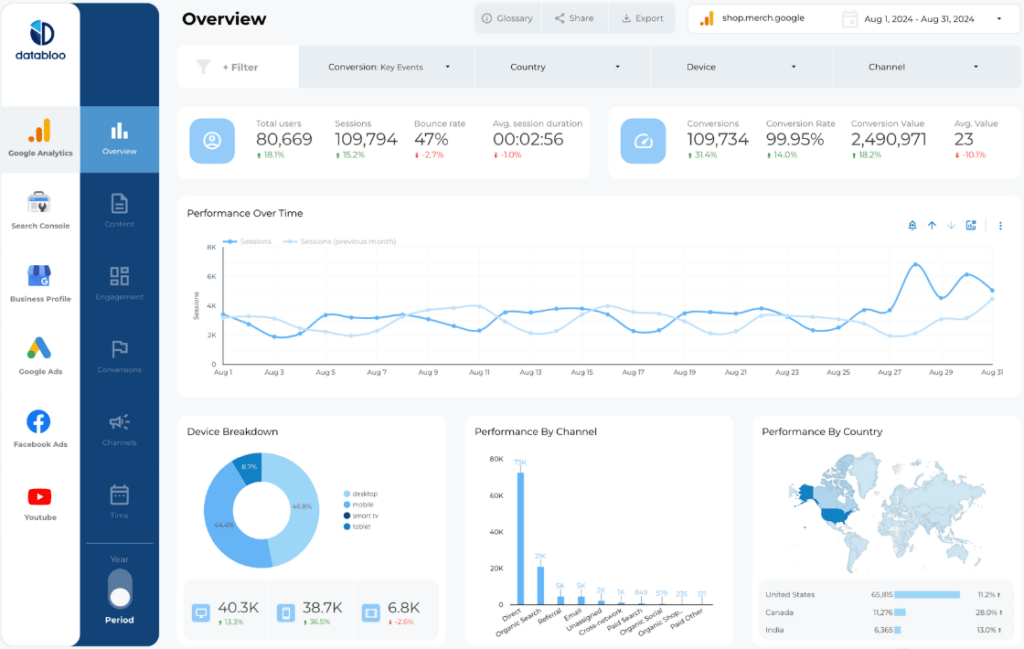
If you’re unsure which to choose, think about your audience. If they’re likely to view the report on mobile or tablets—or if you’re sharing reports during meetings across different devices—go with the responsive option. For detailed internal reports where you want complete design flexibility, stick with freeform.
A Step Toward Better Reporting Across Devices
The introduction of responsive reports in Looker Studio marks a major shift in how dashboards are designed and consumed—especially for mobile users. With a 12-column layout, modular sections, and smart stacking behavior, you can now build reports that look clean and professional on any screen.
While it still has some limitations, responsive reporting offers a huge improvement for readability and user experience. And as the feature matures, we expect more customization options to follow.
At Data Bloo, we specialize in creating Looker Studio templates for teams that need powerful, multi-source reports with a clean, professional design. Explore our gallery to see how we combine performance with usability—and try out the demos to experience it in action.
