Table of Contents
Google’s Looker Studio has introduced Modern Charts, a major upgrade that enhances data visualization with new styling options, improved customization controls, and updated chart configurations. This feature is currently in preview and brings a fresh look to reports with rounded edges, gradient line styles, transparency controls, and refined axis settings.
In this guide, we’ll explore the main improvements, show before-and-after comparisons of classic vs. modern charts, and walk you through enabling this feature in your reports.
What’s New in Looker Studio’s Modern Charts
The Looker Studio’s Modern Charts bring several enhancements to improve the clarity and aesthetics of reports. Some of the key updates include:
- New Default Color Themes – Modern charts introduce updated color palettes for better contrast and readability.
- Rounded Edges for Bar & Column Charts – A subtle but impactful design change that enhances visual appeal.
- Line Gradient Settings – Apply smooth color transitions in line and time series charts for a polished look.
- Transparency Controls – Scatter and bubble charts now allow transparency adjustments for overlapping data points.
- Pie & Donut Chart Padding – New padding controls provide better spacing and alignment.
- Enhanced Axis Customization – Fine-tune grid lines, strokes, axis visibility, title styles, and label rotation settings.
These updates give report creators more flexibility in styling charts while improving overall data presentation.
How to Enable Modern Charts in Looker Studio
Switching to Modern Charts is simple and can be done for individual reports. Here’s how:
- Open Your Report – Edit an existing report or create a new one in Looker Studio.
- Access Theme & Layout Settings – Click on Theme and layout from the top menu or the File menu.
- Enable Modern Charts – Toggle the Modern Charts switch to apply the new experience to all charts in the report.

To revert to the classic chart experience, simply turn the switch off.
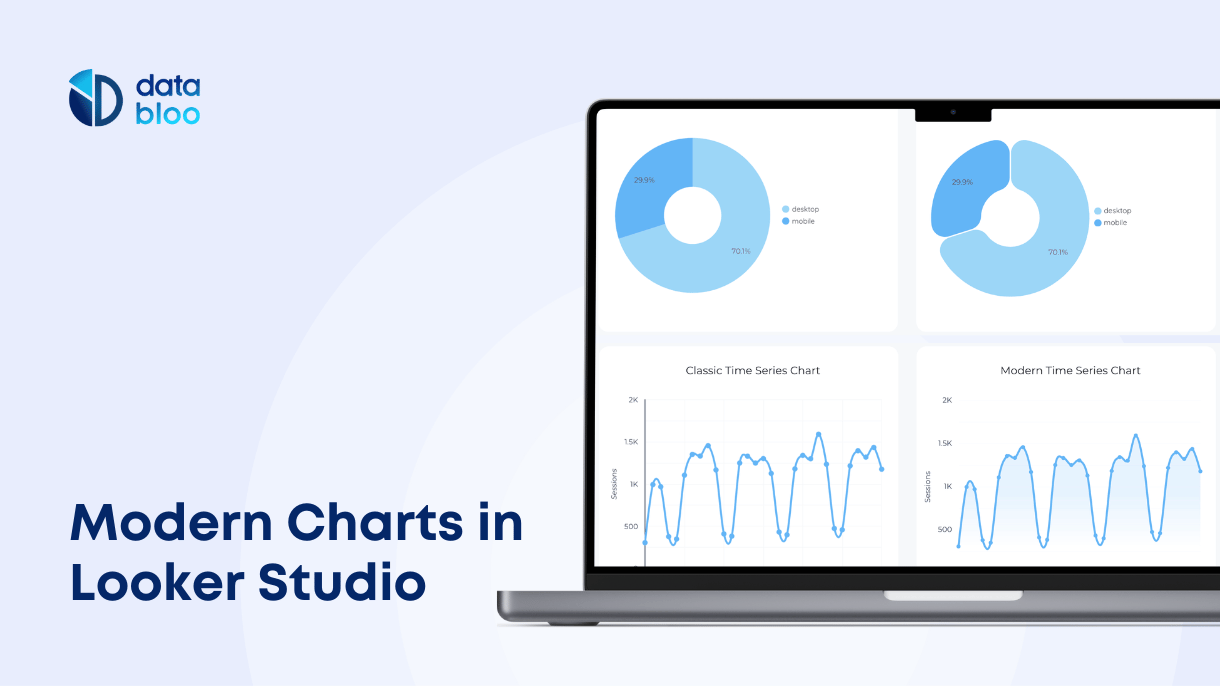
Before & After: Classic vs. Modern Charts
To visualize the impact of these changes, we’ve prepared side-by-side comparisons showcasing how each chart type looks before and after applying this new feature.
Pie Chart
Pie charts display data as slices of a circular graphic, making it easy to compare proportions. With new padding controls and improved spacing, the Modern Chart version appears cleaner, making it easier for users to interpret each segment at a glance.

Bar Chart
Bar charts represent data using horizontal or vertical bars. The new rounded edges and refined grid lines in Modern Charts create a smoother, more polished look while maintaining clarity and readability.

Time Series
Time series charts help visualize trends over time. The new line gradient settings and transparency controls improve data representation, making trends more visually distinct while improving the overall aesthetic.

Each of these updates helps create cleaner, more visually engaging reports while maintaining data clarity.
Modern Charts in Data Bloo Templates
At Data Bloo, we’ve already integrated Modern Charts into our Looker Studio templates, ensuring that users benefit from the latest visualization enhancements. Our reports now feature the updated styling, making it easier to present data in a compelling and professional manner.
Try our Looker Studio templates today to experience the power of Modern Charts in action!