Table of Contents
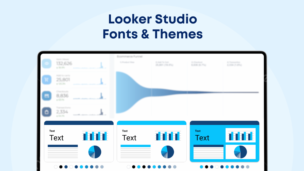
Imagine being able to use any font or completely customize the theme of your Looker Studio report to make it stand out. In this article, we’ll guide you through how to use the default fonts, add custom fonts using a community visualization, and adjust themes to suit your design preferences. From changing the background color to incorporating branded fonts, you’ll learn how to make your reports not only functional but also visually stunning and personalized.
Default Fonts in Looker Studio
Looker Studio provides a selection of about 40 default fonts to style your reports, including classics like Arial, Comic Sans MS, Times New Roman, and others like Montserrat, Roboto, and Lato. These fonts help you create visually appealing and professional dashboards. While the range of fonts is somewhat limited, Looker Studio doesn’t natively support other Google Fonts. Below you will find the full list with the default Looker Studio fonts:
- Arial
- Boogaloo
- Bubblegum Sans
- Calibri
- Cambria
- Chewy
- Comic Sans MS
- Coming Soon
- Cormorant Unicase
- Corsiva
- Courier New
- Droid Sans
- Eater
- Georgia
- Great Vibes
- Impact
- Indie Flower
- Lato
- Lora
- Montserrat
- Oleo Script
- Open Sans
- Orbitron
- Oswald
- Permanent Marker
- Quicksand
- Raleway
- Reenie Beanie
- Roboto
- Roboto Condensed
- Syncopate
- Tahoma
- Times New Roman
- Trebuchet
- Ubuntu
- Ubuntu Mono
- Verdana
How to Add Custom Fonts to Looker Studio
You can unlock more customization options by using a community visualization that supports Google Fonts, giving you the flexibility to incorporate more sophisticated fonts, to improve the look and feel of your dashboards, and ensure brand consistency across your report sections. More specifically you can use the “Google Fonts” by Siavash Kanani to expand your font options. The specific community visualization, allows you to use CSS to incorporate custom Google Fonts into your report titles or sections.
Steps to add Google Fonts community visualization:
- Open a Looker Studio report that you want to add Google fonts.
- Go to the edit mode and from the main menu click the “Community Visualization” icon.
- Then click “+Explore more” and select “Build your own visualization” within the Community Visualizations section.
- Enter the manifest path gs://siavak-visualizations/gallery, select the community visualization “Google Fonts” and then click allow.
- Once you add it to your report, go to the style tab and configure the following settings:
- Content – add your text here
- Style Url – open Google Fonts and paste the url of the font you want to use (i.e. https://fonts.googleapis.com/css2?family=Poppins&display=swap)
- Font Family – add the name of the font (i.e. Poppins)
- Inline CSS – add any custom CSS you want (i.e. color: #000000; font-size: 3)

Combining Fonts in a Looker Studio report
Consistency is key when using multiple fonts in a report. Here are some tips for maintaining harmony:
- Limit font choices: Use a maximum of two to three fonts for your report to avoid clutter.
- Create a hierarchy: Use different fonts for titles, metric values, and descriptions. For example, use a bold, attention-grabbing font for titles (like Impact), a clear and readable font for metrics (like Roboto), and a softer font for descriptions (like Open Sans).
- Match font personalities: Pair fonts with similar design characteristics, such as sans-serif fonts, for a more cohesive look.
This method helps distinguish between sections and elements while keeping the design uniform.
How to Change Themes in Looker Studio
Fonts and themes are closely connected in Looker Studio as both contribute to creating a visually appealing report. For example, after selecting your fonts, you can apply them across all pages in your report by configuring the theme settings in the “Theme and Layout” panel. This allows you to maintain a consistent style throughout the charts and elements of your report. Let’s explore how Looker Studio themes and layouts work, including customizing the background colors, texts, modern chart styles, and other visual elements to align with your design preferences.

- Open your report and click on “Theme and layout” in the toolbar.
- Choose from predefined themes or click “Customize” to edit your current theme.
- You can modify the Primary Styles, including the report background, text styles, component backgrounds, and borders.
- Adjust Accent and Textbox Styles, which include font colors for table headers, buttons, and controls.
- Update the Data Styles, where you can manage the color palette of your report elements.
- Finally, customize Page Navigation to adjust how users interact with your report, changing the look and feel of native navigation menu.

Below you will find an example on how to customize the colors through Theme and Layout settings and change the entire appearance of a multichannel report like our custom master template.
.
.
As you may see, you only need to edit the first four colors from the color palette if you keep consistency across the charts & other elements of your report.
Using Dark Mode and Custom Background Images
Looker Studio also offers an interesting feature where you can extract a color theme directly from an image, like a logo, which helps keep your report on-brand. Go to the theme settings and click at “Extract theme from image”. Then upload your own image or use a specific image url to act as your report’s background.

Also you can change the report background to darker colors for dark mode aesthetics. Either use the predefined theme like “Constellation” or upload an image with dark colors and select corresponding mode. When using dark backgrounds, remember to adjust text colors to lighter shades to ensure readability and a clean visual contrast.
Improve Your Looker Studio Reports with Fonts and Themes
Optimizing your Looker Studio reports through fonts and themes enhances the look and feel of your reports and improves its user experience. Whether you want to create a nice dashboard for your clients or ensure your reports follow your branding, using the right fonts, and customizing themes will allow you to achieve the desired outcome. If you prefer not to deal with the technical setup, you can explore Data Bloo’s ready-to-use templates that deliver clean, well-designed aesthetics, helping you focus more on the insights than the design process.
